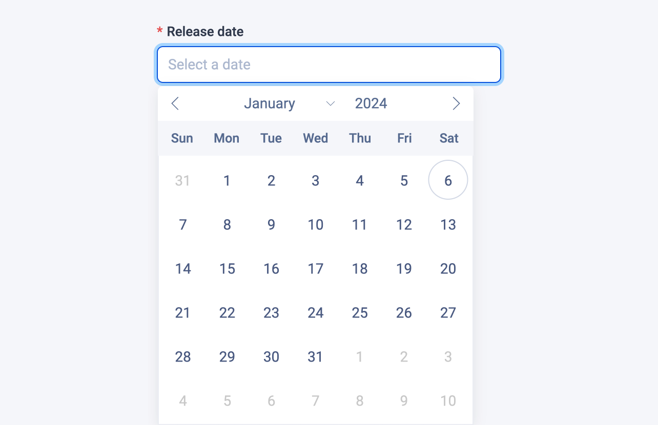
Date field
The date field stores a timestamp in milliseconds to represent a date value.

Examples
Here's an example of using the date field in a block:
# blocks/Product.vue

<template>
  <div>
    <div v-if="releaseDate">
      <span>Release date:</span>
      <span>{{ new Date(releaseDate).toLocaleDateString() }}</span>
    </div>
    ...
  </div>
</template>

<script lang="ts" setup>
import { dateField } from '#pruvious'

defineProps({
  releaseDate: dateField({
    placeholder: 'Select a date',
    required: true,
  }),
})
</script>
Here is another example of how to use it in a collection definition:
# collections/products.ts

import { defineCollection } from '#pruvious'

export default defineCollection({
  name: 'products',
  mode: 'multi',
  fields: {
    releaseDate: {
      type: 'date',
      options: {
        placeholder: 'Select a date',
        required: true,
      },
    },
    // ...
  },
})
Options
You can specify the following options in the date field:
| Option | Description |
|---|---|
| A boolean indicating whether to display a clear button that removes the current value. |
| The default field value ( |
| A brief descriptive text displayed in code comments and in a tooltip at the upper right corner of the field. |
| The field label displayed in the UI. By default, it is automatically generated based on the property name assigned to the field. For example, eventDate becomes Event date. |
| The latest possible date (as timestamp in milliseconds). |
| The earliest possible date (as timestamp in milliseconds). |
| A string that specifies the |
| Text that appears in the input element when it has no value set. |
| Specifies that the field input is mandatory during creation. |
Last updated on January 6, 2024 at 17:01