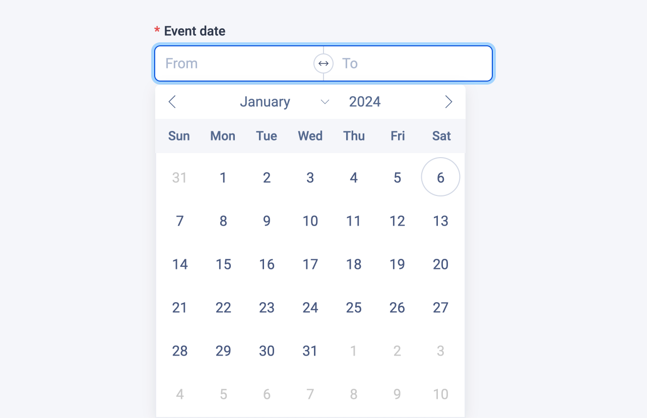
Date range field
The date range field stores a tuple of timestamps in milliseconds that represent two date values.

Examples
Here's an example of using the date range field in a block:
# blocks/Event.vue

<template>
  <div>
    <span>
      {{ eventDate?.[0] ? new Date(eventDate?.[0]).toLocaleDateString() : 'Unknown' }} -
      {{ eventDate?.[1] ? new Date(eventDate?.[1]).toLocaleDateString() : 'Unknown' }}
    </span>
    ...
  </div>
</template>

<script lang="ts" setup>
import { dateRangeField } from '#pruvious'

defineProps({
  eventDate: dateRangeField({
    required: true,
    placeholder: ['From', 'To'],
  }),
})
</script>
Here is another example of how to use it in a collection definition:
# collections/products.ts

import { defineCollection } from '#pruvious'

export default defineCollection({
  name: 'products',
  mode: 'multi',
  fields: {
    discountDate: {
      type: 'date-range',
      options: {
        required: true,
        placeholder: ['From', 'To'],
      },
    },
    // ...
  },
})
Options
You can specify the following options in the date range field:
| Option | Description |
|---|---|
| A boolean indicating whether to display a clear button that removes the current value. The clearable option can be defined as a tuple of booleans, with each boolean representing a picker. |
| The default field value ( |
| A brief descriptive text displayed in code comments and in a tooltip at the upper right corner of the field. |
| The field label displayed in the UI. By default, it is automatically generated based on the property name assigned to the field. For example, travelDate becomes Travel date. |
| The latest possible date (as timestamp in milliseconds). |
| The earliest possible date (as timestamp in milliseconds). |
| A string that specifies the |
| Text that appears in the input elements when they have no value set. You can specify the placeholder as a tuple of strings. |
| Specifies that the field input is mandatory during creation. |
Last updated on January 6, 2024 at 17:41