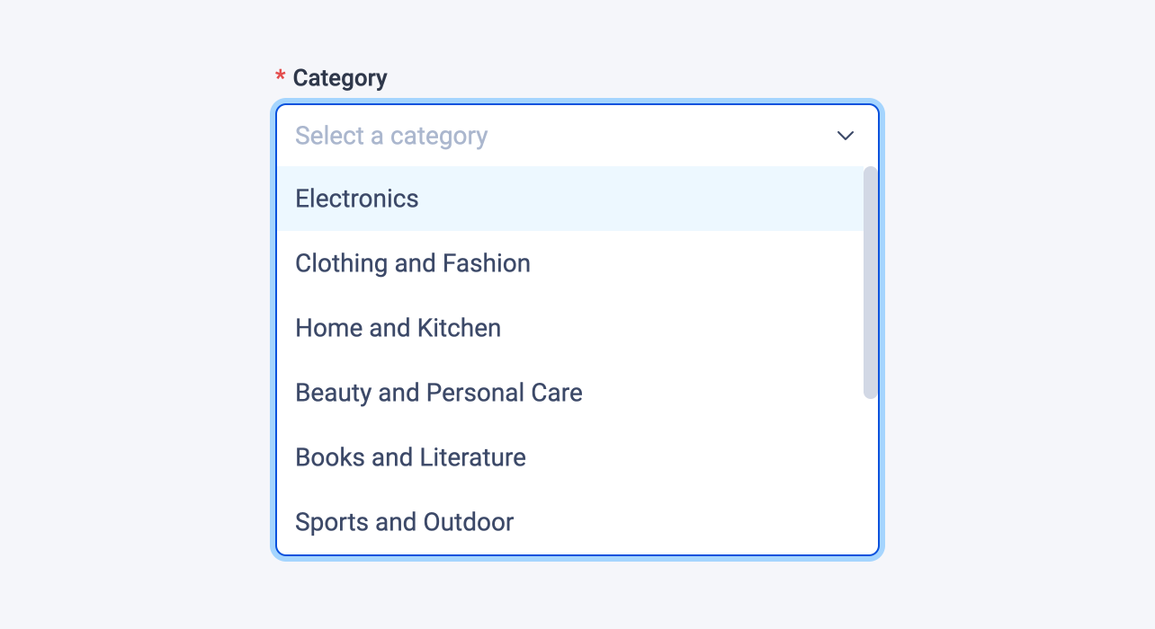
Select field
The select field displays a dropdown list of numerous choices.

Examples
Here's an example of using the select field in a block:
# blocks/Product.vue

<template>
  <div>
    <span>Category: {{ category }}</span>
    ...
  </div>
</template>

<script lang="ts" setup>
import { selectField } from '#pruvious'

defineProps({
  category: selectField({
    choices: {
      electronics: 'Electronics',
      clothingFashion: 'Clothing and Fashion',
      homeKitchen: 'Home and Kitchen',
      beautyPersonalCare: 'Beauty and Personal Care',
      booksLiterature: 'Books and Literature',
      sportsOutdoor: 'Sports and Outdoor',
      toysGames: 'Toys and Games',
      healthWellness: 'Health and Wellness',
      automotiveAccessories: 'Automotive and Accessories',
      jewelryAccessories: 'Jewelry and Accessories',
    },
    required: true,
    placeholder: 'Select a category',
  }),
})
</script>
Here is another example of how to use it in a collection definition:
# collections/products.ts

import { defineCollection } from '#pruvious'

export default defineCollection({
  name: 'products',
  mode: 'multi',
  fields: {
    category: {
      type: 'select',
      options: {
        choices: {
          electronics: 'Electronics',
          clothingFashion: 'Clothing and Fashion',
          homeKitchen: 'Home and Kitchen',
          beautyPersonalCare: 'Beauty and Personal Care',
          booksLiterature: 'Books and Literature',
          sportsOutdoor: 'Sports and Outdoor',
          toysGames: 'Toys and Games',
          healthWellness: 'Health and Wellness',
          automotiveAccessories: 'Automotive and Accessories',
          jewelryAccessories: 'Jewelry and Accessories',
        },
        required: true,
        placeholder: 'Select a category',
      },
    },
    // ...
  },
})
Options
You can specify the following options in the select field (required fields are marked with the symbol R):
| Option | Description |
|---|---|
| A key-value object containing permissible choices, where the key represents the choice value, and the value represents the corresponding label. |
| A boolean indicating whether to display a clear button that sets the input value to |
| The default field value ( |
| A brief descriptive text displayed in code comments and in a tooltip at the upper right corner of the field. |
| The field label displayed in the UI. By default, it is automatically generated based on the property name assigned to the field. For example, iconSize becomes Icon size. |
| A string that specifies the |
| A stringified TypeScript type used for overriding the automatically generated field value type. This feature is only applicable when declaring the field in a collection. |
| Text that appears in the input element when it has no value set. |
| Specifies that the field input is mandatory during creation. |
| The number of visible choices in the dropdown list (must be less than 30). |
Last updated on January 7, 2024 at 16:34